
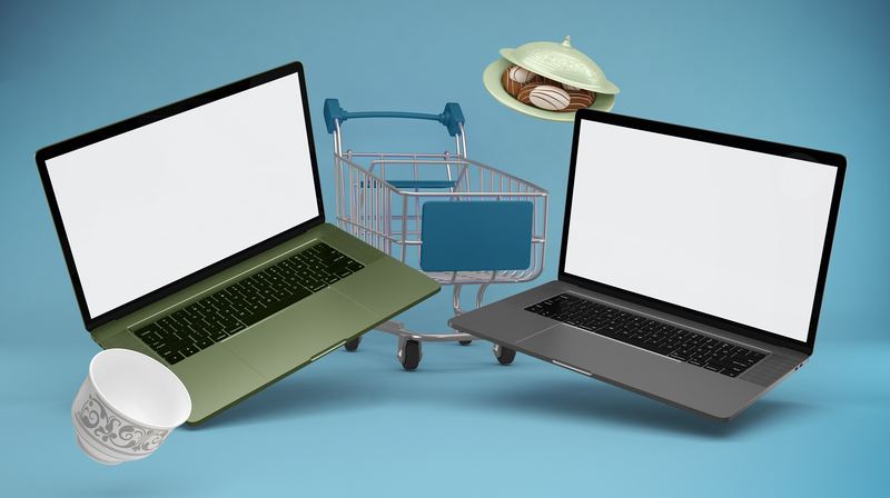
You’ve spent weeks perfecting your Shopify store. The colors are on point, the product pages are clean, and the checkout flow is smooth. But when it comes to showing it off — to investors, on your landing page, in an email campaign — a plain screenshot just doesn’t cut it.
That’s where MacBook mockups come in. They transform a flat, lifeless screenshot into a polished, professional visual that says “this brand means business.” And for Shopify store owners specifically, the right mockup can be the difference between a visitor who bounces and a customer who converts.
Why Shopify Store Owners Need MacBook Mockups
Most e-commerce entrepreneurs focus obsessively on their store’s UX — and rightly so. But your store’s visual presentation outside the store matters just as much. Think about every touchpoint where someone encounters your brand before they even land on your site:
- Your agency portfolio or case study page
- A pitch deck for wholesale partners or investors
- Hero banners in email campaigns
- Social media ads and organic posts
- Product Hunt or Kickstarter launch pages
In every single one of these contexts, a MacBook mockup does the heavy lifting. It gives your store a physical, tangible presence — like placing it in the real world instead of leaving it floating in digital abstraction.
Choosing the Right Mockup for Your Shopify Brand
Not all mockups are created equal, and the style you choose should match your brand’s personality.
A luxury fashion store needs a sleek, minimal setup — think MacBook on a marble surface with soft natural light. A bold streetwear brand might lean into dramatic dark backgrounds and sharp contrast. A cozy home goods shop? Go for a warm wooden desk scene with lifestyle props.
The angle matters too. A straight-on front view works great for showcasing your homepage design in detail. An isometric or tilted perspective adds depth and feels more dynamic — perfect for ads and social posts where you need to stop the scroll.
Real-World Examples: MacBook Mockups in Action
Here’s where it gets practical. Let’s look at how Shopify store owners actually use MacBook mockups day-to-day.
Client presentations. A Shopify designer finishes a redesign for a boutique skincare brand. Instead of sharing a Figma link, she drops the homepage screenshot into a lifestyle MacBook mockup placed on a linen-covered desk. The client sees their brand in context — not just pixels on a screen — and approves the design in the first meeting.
Email marketing. A digital agency sends a monthly newsletter to e-commerce founders. They use a MacBook mockup in the header showing a beautifully laid-out Shopify storefront. Click-through rates jump because the visual feels aspirational — readers see what their store could look like.
Landing pages. A SaaS tool built for Shopify merchants uses a MacBook mockup as the hero image on their homepage. The mockup shows their dashboard inside the screen, placed at a slight angle with a gradient background. Conversion rate: significantly higher than the plain screenshot it replaced.
Social proof & case studies. An agency builds a case study page for a client whose store revenue tripled after a redesign. A before/after MacBook mockup comparison makes the result visceral and shareable.
MacBook Mockups on ls.graphics
If you’re serious about presentation quality, ls.graphics is one of the most trusted names in the mockup world. Their MacBook mockup collection stands out for its ultra-realistic rendering, premium lighting, and obsessively organized layers that make customization genuinely enjoyable rather than painful.
You’ll find dozens of angles — front, side, isometric, floating — along with multiple color styles per scene. Every composition is stylishly minimal, keeping the focus on your design rather than distracting props. The Edit Online feature lets you drop in your screenshot without touching Photoshop. And the generous selection of free scenes means you can explore the quality before committing. For Shopify owners who want their store to look like it belongs on the front page of a design blog, this is the place to start. You can browse the full MacBook collection to find exactly what fits your brand.
Quick Tips for Getting the Most Out of Your Mockup
Before you export, get these fundamentals right — they make all the difference.
- Match the scene to your niche. Wellness brands feel at home in natural light and organic textures. Tech products and SaaS dashboards shine on dark, minimal backgrounds. When the scene matches your brand’s world, the mockup stops looking like a template.
- Use high-resolution screenshots. A 2x or Retina-quality capture ensures your store looks razor-sharp inside the frame. Blurry text inside a beautiful scene undermines trust instantly.
- Don’t overcrowd. One focused mockup beats five cluttered ones. Let your design be the hero — the mockup is the stage, not the show.
Small details add up fast. The right scene, a crisp screenshot, and a clean composition turn a forgettable image into something people actually stop and look at. That’s the kind of visual your Shopify store deserves.
Conclusion
Your Shopify store deserves to be seen at its best — not as a screenshot, but as an experience. MacBook mockups give your online shop the visual authority it needs to impress clients, convert visitors, and stand out in a crowded market. Whether you’re a solo entrepreneur or a growing agency, investing a few minutes in the right mockup pays off every time someone sees your brand. Start with the free scenes at ls.graphics, find the style that fits, and let your store speak for itself.